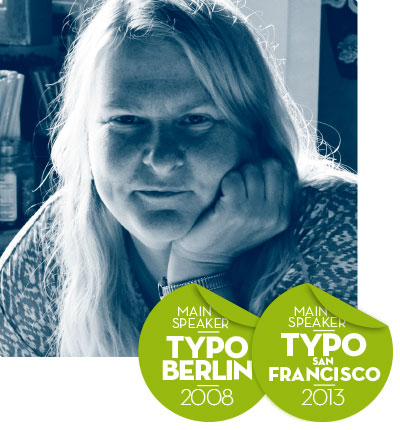
Marian Bantjes
Typography, Illustration, Graphic Design
CANADA
Canadian based graphic artist known for her detailed typography, patterning and ornament. Marian’s work has been published in many books and magazines worldwide, and her 2010 publication I Wonder was shortlisted for the British Design of the Year award in 2011, and her monograph Pretty Pictures was published to critical acclaim in 2013. She has spoken about her work and thoughts at over 100 conferences and events around the world. She is a member of Alliance Graphique Internationale (AGI).
bantjes.com
What is there to say?
Typography and custom lettering has reached a zenith in design and Illustration. Never before have there been so many expert and experimental letterers churning out alphabets, fonts and illustrated words. Unfortunately however, despite this, it seems that many, if not most of these people have nothing to say. Letterforms are for making words, and words are for saying things, and the more you belabour the visual text, the more importance you put on the words. In this talk I will discuss this phenomenon and talk about my own work in lettering and writing, all the while wrestling with how to make a message that means something worthwhile.
Language topic: English
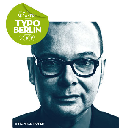
Dieter Telfser
ID-Design, Writing
ITALY / AUSTRIA
One of the most popular South Tyrolean designer abroad. Coming from the field of economics (controlling) Telfser did autodidactic training and became a highly skilled designer. He was one of the official developer of NeXT computer systems and responsible for the corporate re-design of the Austrian broadcasting company (ORF) as well as of the IT-consulting-company Raiffeisen Informatics. Telfser held his unconventional talk ACHTUNG ÄCHTUNG at the Typo Berlin in 2008.
telfser.com
DYE – Dynamic Entities, Systems, Networks
A critical look into the systems and performances of industry in a cross-comparison. Identity as the key in its techniques of power – the consumers in their isolated autonomy. How vital are design processes and their products really to give new and mind opening impulses to the people? Between the beginnings of marking up to this self-differentiated entertainment, lie 40 years of instruments. What good was there in the creation of job outlines that are fully automated nowadays and just wait to be used? The attraction of the core identity of an enterprise and its social education allow insights into their causalities.
Language topic: German
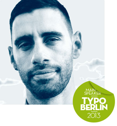
Giuseppe Salerno
Typography, Calligraphy, Branding
ITALY
Giuseppe Salerno, a Turin born designer, is one of the two founders of the design studio Resistenza. es. Since the age of 15, the Italian started to practice calligraphy and is clearly a master in it nowadays. His font collection is constantly growing, as it is also special because of it’s unique and strong character with well-connected handwritten skills. Salerno received international recognition through his appearance at the typo Berlin in 2013 performing “Lettering vs. Calligraphy”.
resistenza.es
We never read, we just look at letters
In this fast-paced era of technology, devices, categories, information overload and the ultimate chaos online, the best way to be connected is to turn everything off for awhile. Nibs, pens and brushes are some of the tools Resistenza uses to get offline and go back to the times when ink, paper and human skills were the best way to communicate. Bringing hand crafted letters to screens is their biggest aim, keeping human and technology connected, online. After 8 years of working, studying and growing, Resistenza Type Foundry is finally ready to tell you some of their stories. Get inspired by their bizarre and fascinating experiences living along the Mediterranean sea and discover their origins, culture & style.
Language topic: English
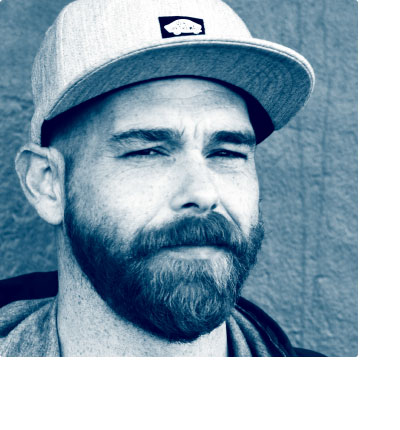
Paco González
Fontdesign, Lettering, Branding
SPAIN
Paco González, is a Spanish graphic designer based in Valencia. He is the co-founder of the design studio Resistenza.es. Having his roots and first working experiences in the tourism branch, González became a highly qualified designer, elaborating visual identities, illustrations and typography, among many other things. He loves to convert analogic elements into digital masterpieces without losing it’s human touch.
resistenza.es
Martin Osen
Human Interface Design, Illustration
AUSTRIA
Austrian multi-talent, working within the fields of illustration, interactive and human interface design, as well as animation and visual communication. Received an award for his thesis IO, a prototype of an universal interface for mobile communication devices. Was involved in the development of user interfaces and kinetic typography for SONY. Works now independently with Red Bull, Audi, Swarovski and Vodafone.
osen.at
The End of Design
These are Golden Ages for designers. Design becomes more important every day, its contribution to economical success is universally acknowledged. The most prosperous enterprises in the world are driven by design. Looking soberly at the most recent developments it becomes clear that an entirely different interpretation is more plausible: It’s the end of design as we know it. Most designers of today might be obsolete tomorrow. There are many examples from the past proving that a designer is not always necessary for functional and esthetic creations. Also the raison d’être of many designers nowadays who try to reduce the ubiquitous abundance to a bearable minimum and thus perpetuate in a paradox way can only be a temporary phenomenon. The simulacrum of the “intelligent designer” is faced with a more evolutionary concept. Design will shift to the basics where conditions, structures and algorithms leading to good designs are created. Only a small part of today’s designer industry will actually make that move. The significantly bigger part of the “Creative Industry” – and here come the good news – will be free to take on different tasks in life. We should try and adjust in good time.
Language topic: German
Jay Rutherford
Visual communication, Typography
CANADA / GERMANY
Canadian-born independent designer, teaching visual communications at the Bauhaus University in Weimar, Germany. Specalized in typography, corporate- and information design, known for his collaboration on type design projects with Erik Spiekermann. A frequent speaker at conferences such as ATypI and TypeCon, and juror at international design competitions.
uni-weimar.de, typecamp.org
On becoming a nerd
Where do nerds come from? What is it about their upbringing, or perhaps genetic makeup, that makes them nerds? Is nerdness a good thing or a bad thing? How do we avoid turning our children into nerds? Or how can we ensure that they become nerds? In this talk I would like to reveal the development of a particular nerd over several decades, how he became a nerd, what happened as he grew up, and what he’s doing now.
Language topic: German, English
Phillip Comarella
Salon Alpin
Visual Art, Illustration, Animation
ITALY / AUSTRIA / PORTUGAL
Salon Alpin is a visual production studio shifting between visual art, typography, graphic design, illustration, animation, film direction and music. We believe in interdisciplinary creative work, handcraft and simple storytelling. Our team combines exceptional skills with innovative mixed media production techniques. Salon Alpin developed projects for clients such as Montblanc, Redbull, Bwin, Blizzard Entertainment and Ted during the last years.
The art director Lip Comarella studied 2005 at the University of Applied Arts in Vienna and co-founded the studio Salon Alpin with his partner Simon Griesser in 2011. Comarella was a speaker at the Forward Creative Festival in Vienna and Munich in 2016 as well as at the IFCC in Zagreb in 2015.
Speaker: Forward Creative Festival Vienna/ Munich 2016, IFCC Zagreb 2015
salonalpin.net
Happy inside the Box
Looking behind the scenes of some of his most successful projects Lip Comarella will describe his experiences dealing with the limits of everday work. Real and self-inflicted artistic limitations should be considered less as an obstacle and more as a driving force of creativity. When everyone else is thinking OUTSIDE THE BOX, Philipp loves to stay inside the box. Only a well-marked frame allows creativity to become truly unlimited.
Language topic: German